Burndown Chart
A burndown chart is a graphical depiction of the work remains in a project and the amount of time a team needs to complete it.
Updated: October 30, 2023
A burndown chart is a graphical depiction of the work remains in a project and the amount of time a team needs to complete it. This chart is used by agile teams to stay on track during work sprints, one-to-four-week periods.
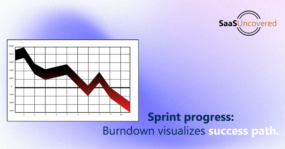
The burndown chart is posted by the teams in an accessible location and is updated regularly. The number of remaining tasks, called user stories in agile is shown by the vertical axis whereas time is shown by the horizontal axis.
Product management software is used by agile software teams to create burndown charts and organize tasks. A project management software will be used when other teams use the agile methodology. Burndown charts are popular in agile project management tools that are used by teams to track progress and spot problems.
The sprint burndown chart and The product burndown chart are two main types of burndown charts. Vertical axis, Horizontal axis, Actual work line, and Ideal work line are basic elements of a burndown chart.
Everyone can get a clear picture of a project or sprint in a project with many moving parts and contributors by using a burndown chart. It helps keeping the team on track, encouraging collaboration and motivating team members.
Teams can manage their time more efficiently and improve communication about their goals with a burndown chart. Teams should make accurate estimates, update and check the chart often as well as analyze the chart to make the most of the burndown chart as a tool.
Key benefits of using a burndown chart:
- Visual Progress Tracking
- Efficient Resource Allocation
- Early Issue Identification
- Predictive Analysis
- Motivation and Accountability
- Improved Communication
- Better Decision-Making
- Reduced Scope Creep
- Enhanced Planning
- Stakeholder Confidence
- Quality Assurance
- Risk Mitigation


